This bird is full of symbolism:
- Birds represent freedom, hope, etc.
- Also, as a way to represent the people who “flew away” from Reddit.
- The bird is from Oceania, sounds silly but is not a animal commonly found in nature outside that place, meaning it evokes foreignity for a part of the userbase here.
- C’mon guys, is a Cacatua, it can’t get cooler than that…
deleted by creator
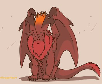
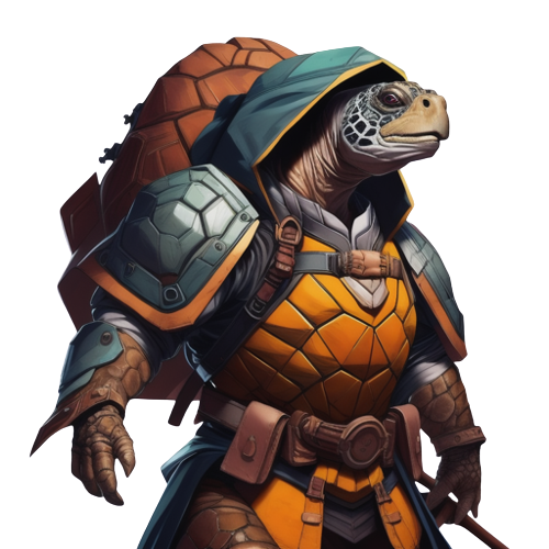
I agree that Kbin could use a mascot (not necessarily need a mascot), but IMO the current proposals are not furry enough in this year of the Fediverse of 2023.
No offense, but what is wrong with the current icon? The purple folder looks great.
Looks a bit microsofty to me, tbh. Like it’s another app in the office suite.
/u/fixedfun 's parrot is more lighthearted. Like the snapchat ghost or twitter bird.
Apparently there’s a kbin app in development. Don’t feel the folder thing is a good fit for an app tile tbh.
Yeah, but the kbin app already has a logo, it looks like a little bow and arrows. Or maybe the bow is a moon? It has arrows. I find the various elements questionably sized in relation to each other, but aside from that I like it.
Though tbh, if it somehow didn’t, I’d be happy with the folder symbol. I think where logos are concerned, likely I just really like simple designs and dislike animals
I believe the Artemis logo is a play off the NASA space program. It looks like a spaceship going out into space or a similar theme.
Artemis is a third party app.
A folder isn’t “fun.” Like, reddit has the Snoo alien or whatever, and they went the extra mile of letting users represent themselves with custom Snoo avatars made up of preset parts like a character creator. It’s fun, and having a mascot here would be fun too.
Reddit does have that… and it was implemented in like… Reddit’s 10th year of operation. It’s not a priority.
I vote the left one or some variant of it
.


